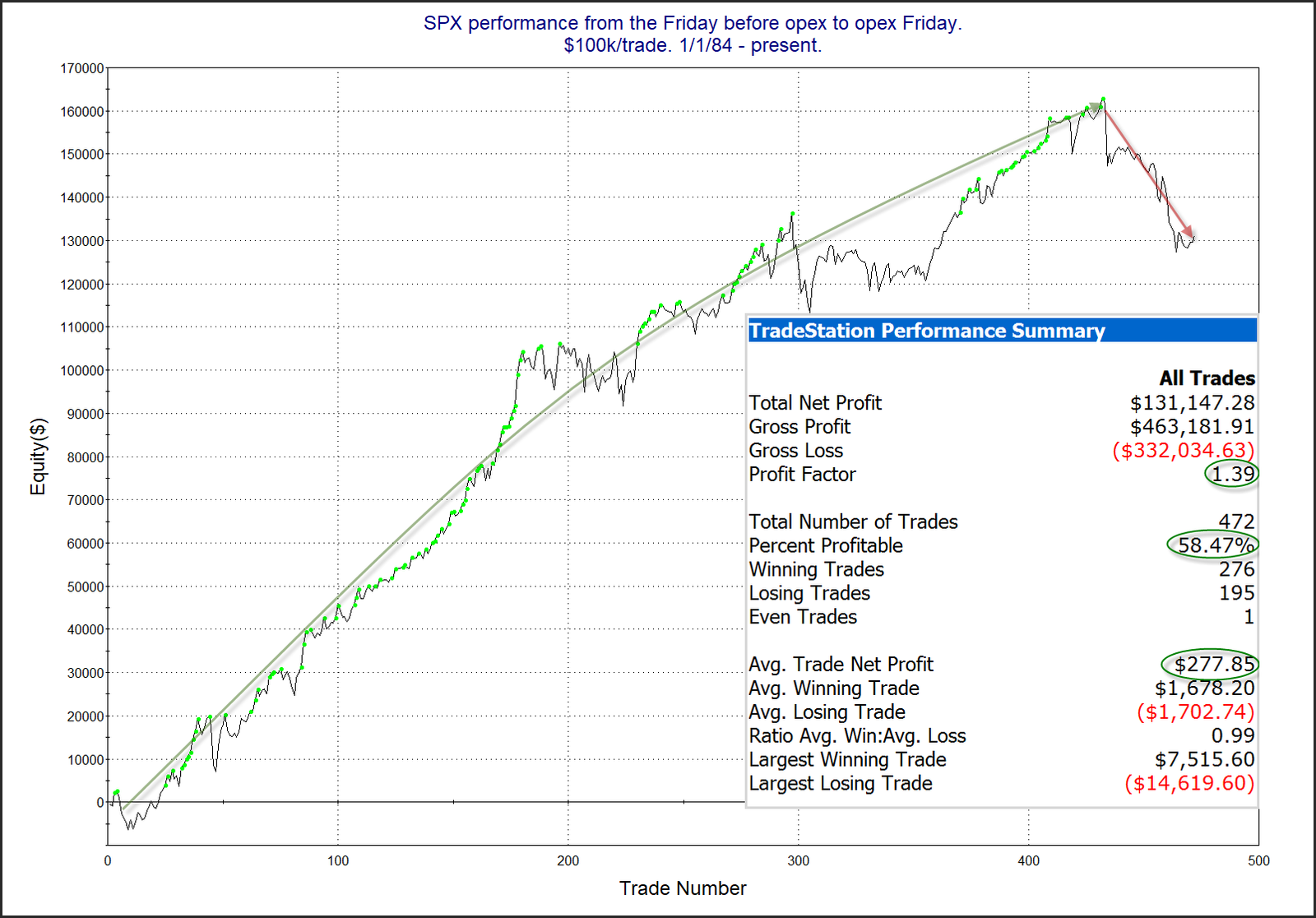
This week is options expiration week. And we have known for a long time that opex is often a bullish week for the market. Interestingly, that seasonal tendency has not seemed to hold true since the COVID crash in 2020. Below is a look at performance of all opex weeks since 1984.

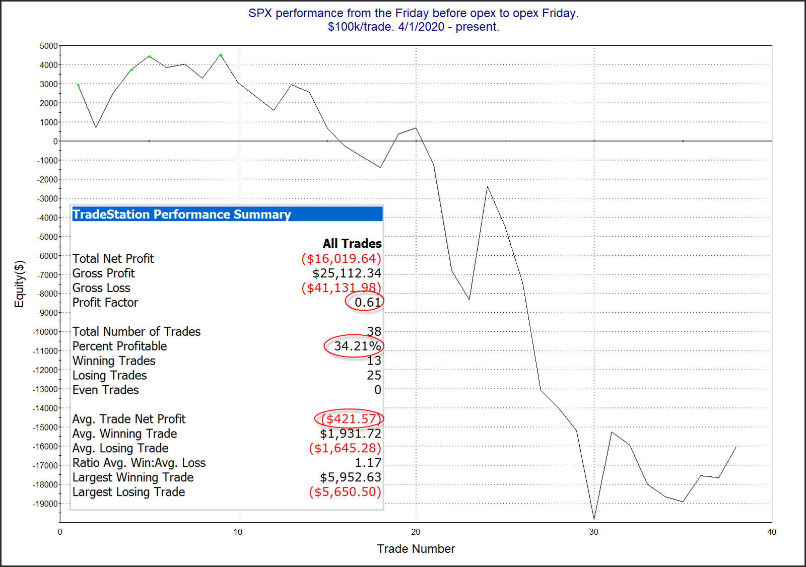
There has been a clear shift in the curve over the last few years. The top of this curve came in January of 2020. February of 2020 saw a decline of 1.25%, and then March had the worst opex week ever, with a 14.6% drop. But unlike other periods, opex week has never recovered its bullish tendency. The chart below looks at performance since April of 2020. I started the chart at that point simply to see how it has done since the market bottomed in 2020. So this does NOT include the worst week of March 2020.

There has been a little bit of a bump up over the last few instances, but the stats and curve still look pretty awful. I am not yet convinced that downside tendency of the last few years is a new seasonal trend. But I certainly see enough evidence here that I am no longer looking at opex weeks and automatically thinking they are bullish.
Want research like this delivered directly to your inbox on a timely basis? Sign up for the Quantifiable Edges Email List.
How about a free trial to the Quantifiable Edges Gold subscription?
