I decided to do a follow-up on yesterday’s post and include some pictures. What we’ll uncover through this exercise is that the edges aren’t quite as cut and dry as they might appear by simply looking at the end results. (Hint: they almost never are.)
Rather than view a table I’ve put together 4 equity curves based on owning the S&P when it was in a certain quadrant. I’ve also changed the test to buy $100k worth of the cash index rather than 1 share. This effectively gives us percentage returns. It also changes the end results slightly so you’ll need to be aware of the differences.
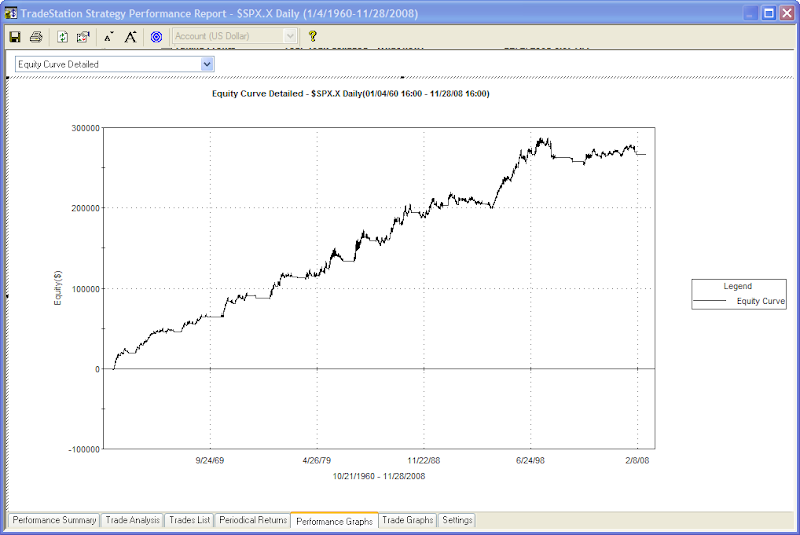
First let’s look at owning the S&P when it’s above the 200 and 50 day moving averages. Recall from yesterday that since 1960 the market has spent 53% of its time in this quadrant:
Over time this market position has been a steady winner. It has sat out bad drawdowns and has had some nice upside participation. I find it interesting that it peaked in 2000, though. The most recent bull market of 2003-2007 failed to see much headway at all when the market was above these two lines. I would classify it as a weak bull. It was extremely rotational and saw little in the way of buying enthusiasm when the market began hitting new highs. While I observed these characteristics at the time, this is the first time I’ve viewed it in this manner.
Now the 2nd quadrant – above the 200ma and below the 50ma. Recall from yesterday that since 1960 the market has only spent 15% of its time in this quadrant:
Here we see that this was not a bullish quadrant to be in until the bull market of the 80’s began. During the 60’s stocks spun their wheels in this area and during the 70’s they lost money. The total gains are not as large here as in Quadrant 1 when looking at percentage gains. Yesterday they were larger when looking at point gains. That’s due to the fact that this quadrant did its losing early on when the points were low and its winning more recently when the points were high. Thus the point gains were a bit exaggerated.
The exaggeration is not a bad thing. In fact, using points rather than %’s basically front weights more recent developments. Think of it as an Exponential Moving Average vs. a Simple Moving Average. The gains since 1980 have been much greater per day in here than in Quadrant 1. The total percent gained is almost the same over that time and the market has spent over 3 times the amount of time in quadrant 1 vs. quadrant 2. (55% vs. 16% since 1980) Again, Quadrant 2 outperforms Quadrant 1 although its not as obvious just from the graph. Short-term pullbacks in long-term uptrends have made for good buying opportunities.
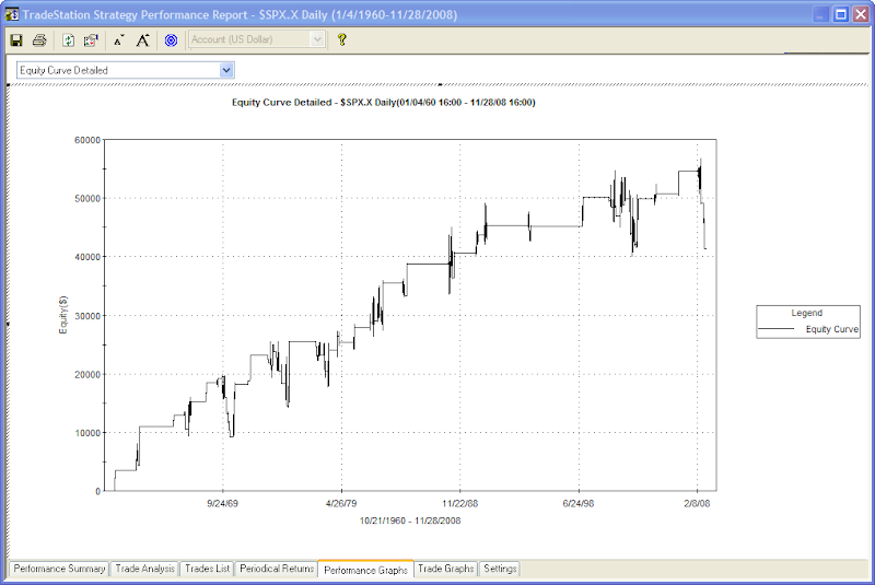
Now Quadrant 3 – below 200ma and above 50ma. The market has spent its least amount of time here – only 9% of days since 1960:
Now let’s look at Quadrant 4 – below the 200ma and below the 50ma in which the market has spent 23% of its time.
A few spikes up when the market was emerging from a bear market or steep correction. Other than that it was not a place you wanted to bet on the long side. When the market enters this quadrant from above it’s probably best to adjust your strategy and trade in bear market mode.
A big take-away is that the market evolves over time. Sometimes this is missed when looking only at tables. Sometimes equity curves are able to capture this well. By understanding how the market has reacted in the past, especially the more recent past, we can better adapt our trading to take advantage of its movements.
——————————————————————————————-
Dr. Brett Steenbarger of Traderfeed also discusses market evolution and he had an especially interesting post today about how reaction to bearish momentum days has changed over the last several years.


