Notable on Friday was that the 50-day moving average of the SPX closed below its 200-day moving average. This is often referred to as a “Death Cross”. (When the 50ma is above the 200ma that is a “Golden Cross”.) This is the first Death Cross since early 2012. Let’s take a brief look at Death Crosses for SPX and see if they have lived up to their name.
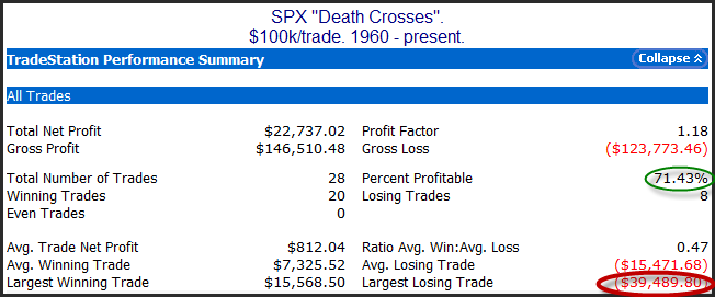
Below are stats if someone was to invest $100k into the SPX each time the market entered a Death Cross, and then held until the 50-day moving average moved back above the 200-day moving average.

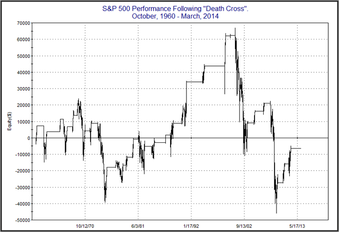
As you can see, this would actually have been a winning strategy over 71% of the time. The problem is the losing trades were very large, with the largest being almost a 40% hit. It also needs to be noted that the above stats are not compounded. They just look at $100k/trade. If we reinvest all the gains & losses, the impact of the giant losers becomes more pronounced. Below is a profit curve for a hypothetical portfolio taking these same trades that includes compounding.

As you can see the net result since 1960 would have been a loss of 6.35% to the hypothetical portfolio. (Assumes no interest while out of the market, and no other expenses.) So most of the time the Death Cross turns out to mark nothing more than a moderate market correction. And long-term traders would be better off riding out that correction than jumping in and out based on the Death Cross / Golden Cross formation. BUT there is a risk that the correction could turn into a nasty bear. In those cases, long-term investors would get slammed. And it does not take many big bear markets to ruin the long-term profit curve. So while not a reliable timing device, it is notable that the market has failed to generate long-term profits under the Death Cross. Traders that are concerned with preserving capital could utilize Death Crosses to possibly avoid big portions of nasty bear markets.
Want research like this delivered directly to your inbox on a timely basis? Sign up for the Quantifiable Edges Email List.
